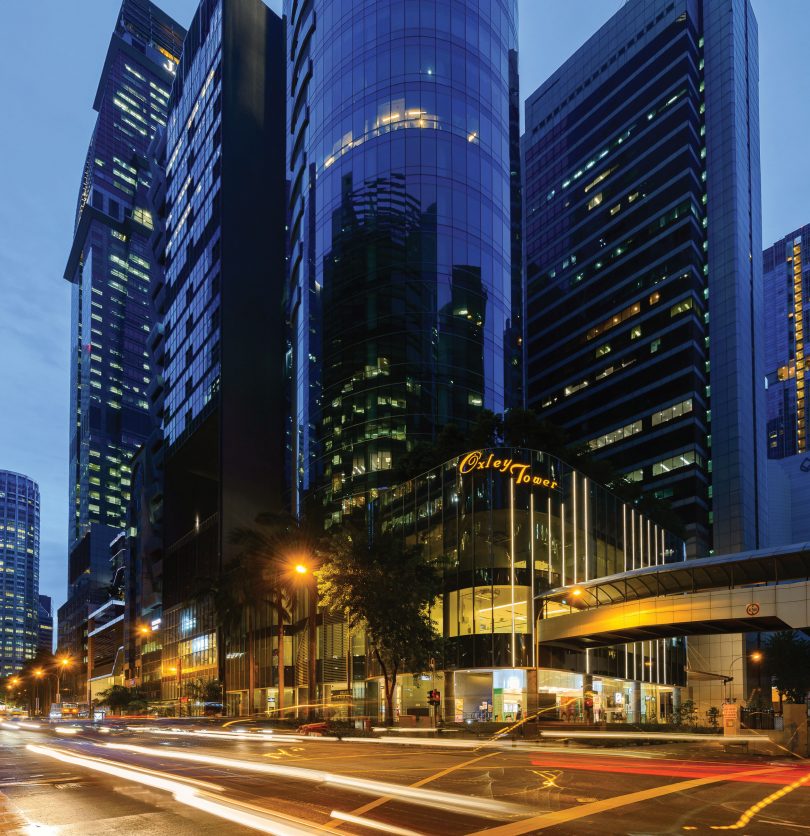
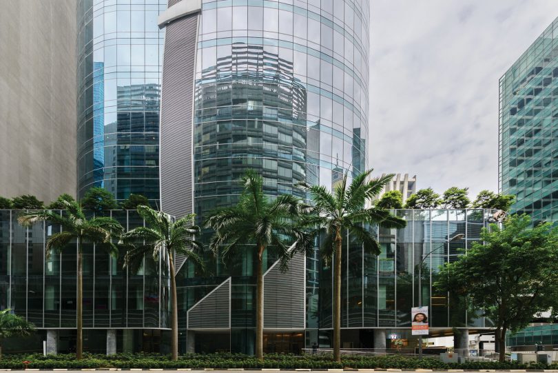
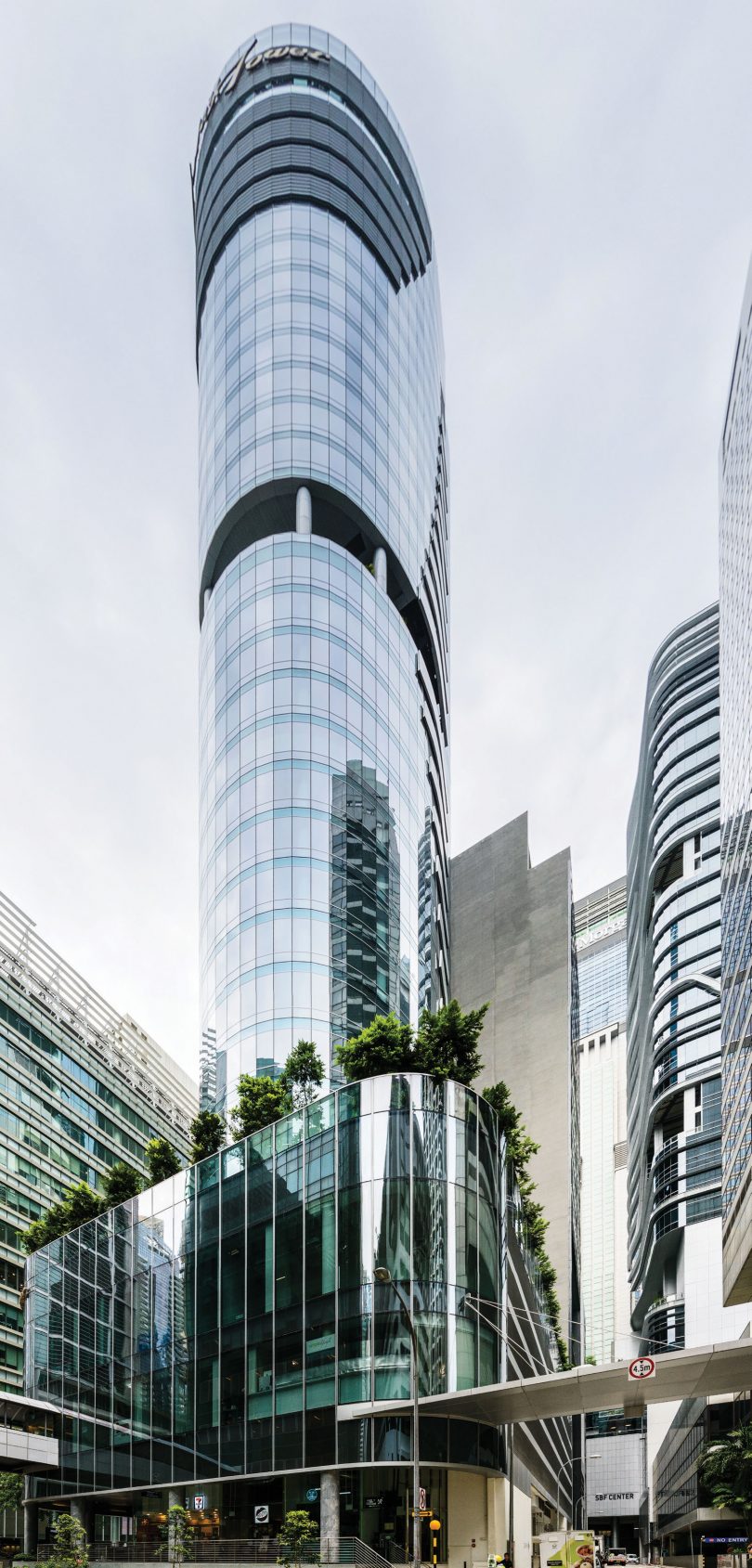
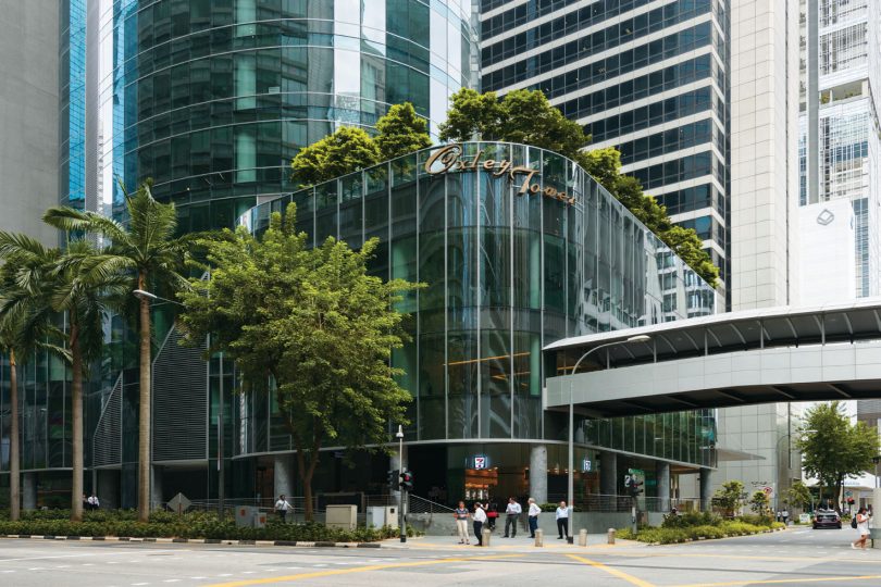
Oxley Tower is a freehold strata-titled commercial mixed development consisting of shops and F&B outlets at the podium and predominantly office units at the tower. Launched back in 2012, it was one of the first few strata-titled developments located in the prominent central business district (CBD) area.
DESIGN
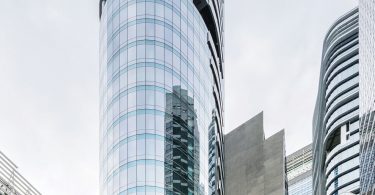
Oxley Tower was conceived as a masculine building. The inspiration came from the armoured knights of ancient times. The use of elements of the knight’s armour was influenced by Ching Chiat Kwong and Eric Low from Oxley Holdings. Parts from the knight’s armour were carefully selected to clad the tower both architecturally and metaphorically. For example, the crown of the tower is the ‘visor’, which represents vision, while the top front of the tower is the ‘gauntlet’, which symbolises power and defence.
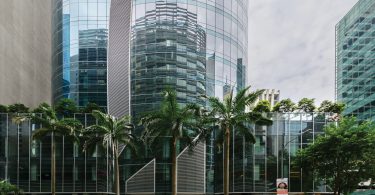
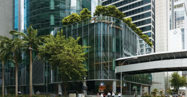
The extensive glass façade of the elliptical tower is created with light and mid shades of blue, with the podium finished in the glazing of a grey tint. With the use of various colour hues, this dispels the monotony, creating a contrast and a visual depth whereby the lighter tone protrudes and the darker tone recedes. The light blue curve is designed to wrap around the smaller half, finished in the curtain wall glazing that is of a darker blue.
The office units at the tower are designed with exclusive direct lift access, which is a distinctive feature of Oxley Tower. The tower units have a high floor-to-floor height of 4.9 metres, which helps to open up the unit space and allow for interior design configuration flexibility and expression. All the office floors are designed such that the utilities and service areas are located in the central core and the office units are such that each of the four units on the typical floor would benefit and enjoy the panoramic view of the city.
The first-storey common areas, such as the lift lobbies and covered walkway, are designed to be in simple lines and geometries consisting of predominantly grey and white hues, keeping the architectural language and outlook clean, simple and consistent throughout the entire building.
PHYSICAL CONNECTIVITY
Oxley Tower is located at the junction of Robinson Road and McCallum Street, and is within walking distance to the Tanjong Pagar MRT station. Being a new development in the Downtown Core planning area, additional provisions and design features that fulfilled the strict planning parameters and urban design guidelines had been incorporated.
Sheltered secondary pedestrian circulation networks are provided above ground as well as on street level. Pedestrians in the area are provided with weatherproofed access and connection between Oxley Tower and its neighbouring buildings. The second-storey pedestrian bridge connection has been made inclusive to facilitate the use by persons with disabilities, older persons and other intended users with the provision of a dedicated access route and handicap-friendly lift to the second-storey link as well as easier accessibility to the second-storey shops. At grade, an overhead lightweight canopy provides sheltered street connectivity between Oxley Tower and GB Building located across the Service Road at the back of the development.
GREENERY
With pockets of green interspersed throughout the building, the high-rise greenery helps to improve air quality and achieve a better environment. It also adds to the garden city image of Singapore by providing lushly greened spaces that enhance the overall well-being of the occupants, as well as informal spaces to rest or interact/bond with fellow colleagues.
A sky terrace, which is open to the public, is located on the 19th storey. This double-volume green pocket breaks up the repetitive outlook of the office building, providing a space of respite to the building occupants and a view of downtown Singapore to the visitors.
ENVIRONMENTALLY FRIENDLY FEATURES
Sustainable Green labelled products were used throughout the development, such as drywalls, block walls, waterproofing, plastering, screeding, skim coating and low-VOC paints.
Water-saving measures that benefit the development throughout its life cycle had been adopted, which include the selection of water-efficient sanitary fittings and implementation of automatic water-efficient irrigation system with rain sensor for the landscaped areas.
Efficient LED lighting and air-conditioning equipment are designed to reduce energy consumption and wastage. All lifts are installed and fully integrated with Variable Voltage Variable Frequency Drive and capable of entering sleep mode to conserve energy when not in use. Gearless drive is also one of the features of these energy-saving measures and makes the lifts operate more efficiently. The passenger lifts are designed to be double-loaded, with door openings on both sides. This increases the efficiency of the lifts and reduces the need for provision of additional lifts, conserving the energy consumption in the building.
The floor plate is designed to be highly space-efficient with the core located centrally. The central core is compact and contains most if not all the pertinent services of the entire building. This compact core minimises the common area footprint, which requires less energy to ventilate these areas and results in less energy wastage.
MATERIALS
Precast planks with spans of up to 6 metres were used in the typical office floor area (fifth storey to 32nd storey) to speed up the overall construction period. They were produced off-site in a precast yard and productivity was greatly improved due to the repetition in production. The production of precast planks commenced when the basement work was going on so that they could be installed quickly on-site.
Vertical structural elements, such as core wall and columns, were designed using high-strength concrete of Grade 60 to reduce the member size and dimension. Hence, there is a greater amount of floor space, especially the lower floors, as the area occupied by the core wall and columns decreased when compared with using normal concrete. Smaller column and wall size translates to lower self-weight, hence reducing the loads for foundation design and saving in piling construction.
SEMI TOP-DOWN CONSTRUCTION
Due to the close vicinity to the existing East West Line and the neighbouring building, semi top-down construction was adopted for the basement construction instead of the conventional bottom-up construction. The stiffness of the horizontal structural elements (basement slab) was able to provide excellent lateral structural support during excavation and minimise the movement of the diaphragm wall and surrounding underground structures better than temporary lateral support in bottom-up construction. In addition, the overall project construction period was also shorter than the conventional bottom-up construction as the temporary lateral support was not required at all, saving the time required for installation and dismantling.
NUFORM AUTOMATIC CLIMBING WALL FORMWORK SYSTEM (NFAC)
NFAC is a hydraulically operated self-climbing formwork system and a significant improvement over conventional jump formwork in terms of productivity and safety. It was mainly adopted for the casting of the main core wall. The hydraulic climbing system is an independent system and able to lift the entire unit safely without using the tower crane, which saves crane operation time. The fully enclosed system also provides a safe working environment at any height.
SITE CONSTRAINTS AND REQUIREMENTS
Due to site constraints, the tight control over site movement and effective/well-planned scheduling of construction material delivery of subcontractors and suppliers was important.
To enhance the character of the Civic District, the Urban Redevelopment Authority (URA) requires developments to be lighted up in a subtle and elegant way. A detailed lighting design scheme for Oxley Tower had been developed, proposed to and evaluated by URA before its final implementation. LED strip lighting was integrated into the recess of the curtain wall mullions at the podium, minimising any superfluous details and keeping the façade looking clean and neat whilst enhancing the liveliness of the building at street level.
For the tower, the metallic louvres that cleverly screen off the M&E services behind the façade is backlit and washed by soft lighting during the night, lending focus to the wing-like, curve features at both the front and back elevations of the building. Not only do the louvres serve a practical purpose of screening off the unsightly yet necessary mechanical and electrical equipment from public view, but the screens were also transformed into a design feature, setting the building apart from the other more sombre buildings in the area.
For the landscape approach, the compliance with the 100 per cent landscape replacement area (LRA) requirement resulted in the creation of a garden theme that gives occupants an almost immediate access to green spaces under one roof.
One of the challenges faced was also the mitigation of the required raised platform levels due to concerns of flood occurrence from the National Environment Agency. Covered and open walkway levels had to be mitigated, whilst also catering to the needs of the physically challenged with floodgates incorporated.
PROJECT DATA
Project Name: Oxley Tower
Location: 138 Robinson Road, Singapore
Completion Date: December 2016
Site Area: 16,102.81 square feet
Gross Floor Area: 16,755.20 square metres
Building Height: 32 storeys (3-storey podium with shops/cafés and a 29-storey tower)
Number of Units: 237 (8 cafés, 3 restaurants, 121 shops, 1 gym/spa and 104 offices)
Car Parks: 3 levels of basement car park
Developer: Oxley Consortium Pte Ltd
Sales & Marketing Director: Eugene Lim
Architecture Firm: RSP Architects Planners & Engineers Pte Ltd
Principal Architect: Hazel Ang
Civil & Structural Engineer: RSP Architects Planners & Engineers Pte Ltd
Mechanical & Electrical Engineer: Squire Mech Pte Ltd
Quantity Surveyor: Arcadis Singapore Pte Ltd
Lighting Consultant: WSP Parsons Brickenhoff
Landscape Architect: COEN Design International Pte Ltd
Main Contractor: Lian Beng Construction (1988) Pte Ltd
Images: Oxley Consortium Pte Ltd

 Malaysia
 Hong Kong
 Indonesia
 Tiếng Việt
 ประเทศไทย


