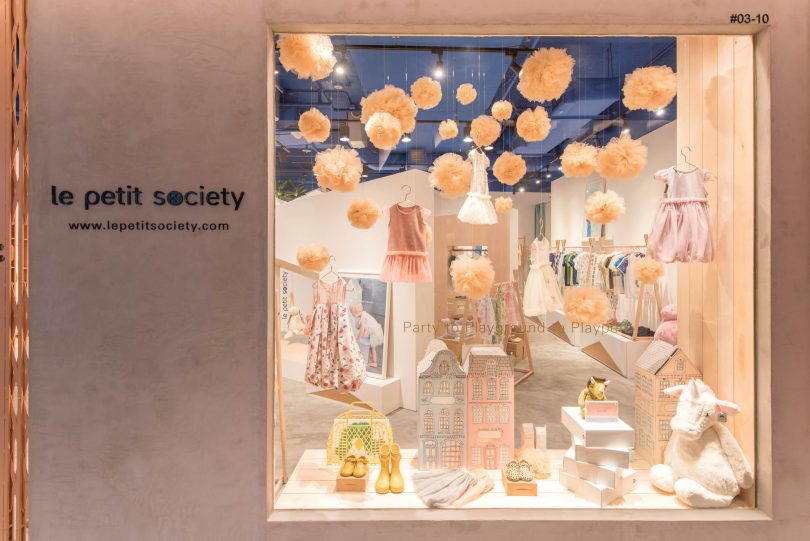
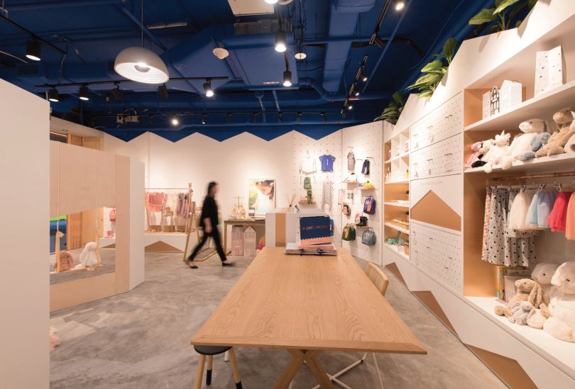
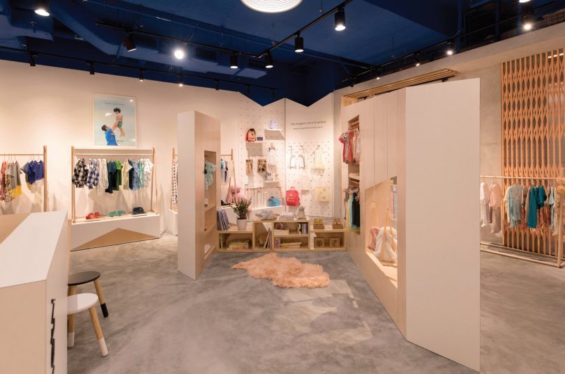
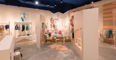
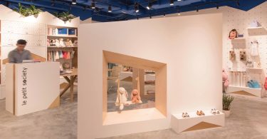
Design firm TA.LE Architects wanted to create an environment that is delightful, comfortable and attractive for both children and adults in the Le Petit Society “In Real Life” Concept Store. Natural and different textured surfaces such as raw wood, fabric, metal and concrete were used to create a space that is a backdrop for the colourful merchandise.
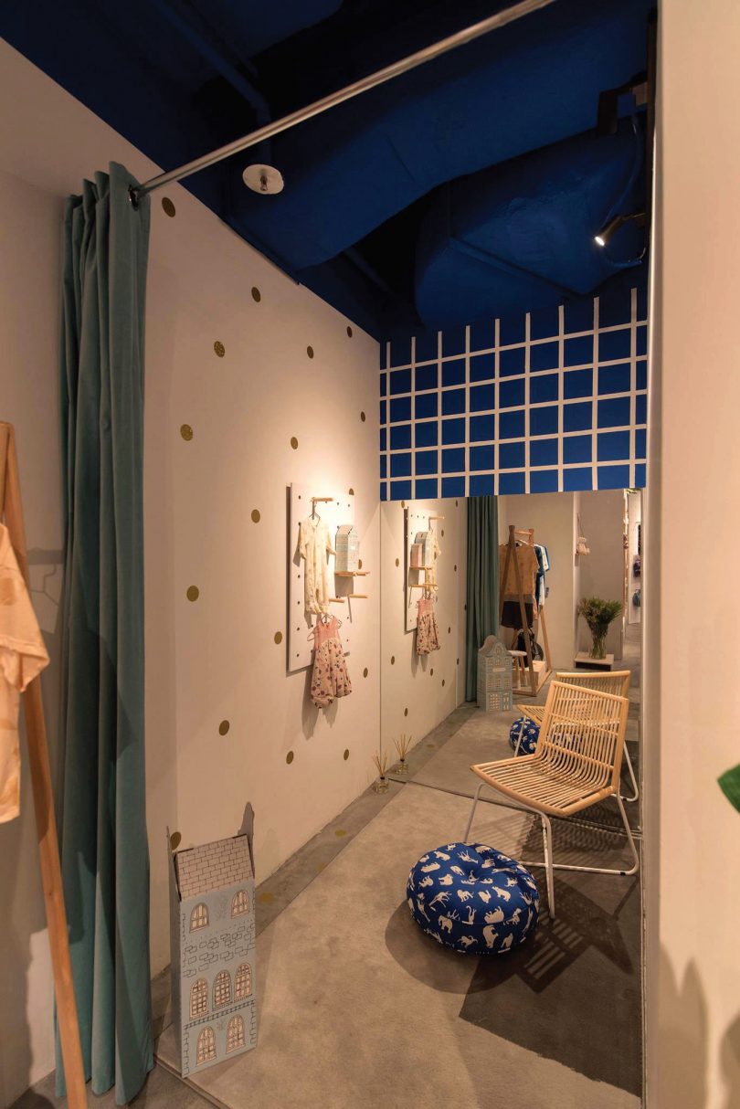
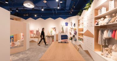
With the goal of creating an identity for the shop at the heart of the design directive, the ceiling of the shop was painted a brilliant blue tone to resemble a twilight sky—injecting an element of fun into the design. Throughout the store, the selection of materials demonstrate a playful superimposition of different colours, textures and materials, such as the pink of copper against the rustic concrete and pairing with the rawness of the plywood.
THE MAILBOX
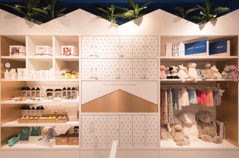
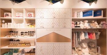
Given that the mode of shopping has evolved drastically over the last decade with online shopping gaining popularity among the younger demographics, the team at TA.LE Architects worked with brand founders, Robyn Liang and Dylan Ong, to incorporate the concept of online purchases with in-shop collection. A series of specially designed cubicles, akin to mailboxes were built to store packed purchases ready for collection by shoppers.
THE PLAYPEN
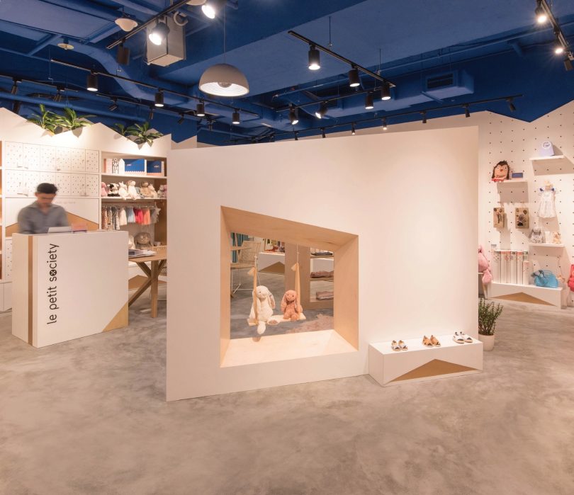
Tapping on the idea of exploration, a structure was created at the centre of the store. The architectonic sculpture resembled those in art galleries, where shoppers can move around and enter the structure to view merchandise on display, thus prolonging their stay. Low shelves double up as seats for children during shoe fittings or when browsing through the curated collection of Chinese language books. Made up of modular pieces, the structure can also be rearranged to suit the occasion. The cosy area, coined the ‘playpen’, is intended for hosting in-store events such as storytelling sessions.
MODULAR FURNITURE SYSTEM WITH LINEAR PLAY FOR CONTINUITY
With the client’s brief for easily movable furniture pieces, the design team started with a tall unit design and broke down the cabinet into three stand-alone parts that can be disassembled if required. The top part bears a playful crown frame that is made to hold indoor plants, while the middle part—the body of the cabinet—comes in three versions: display shelves, mailboxes and hanging racks. As the final component of the cabinet, the lower base is a pull-out drawer for storing additional stocks. This clever modular system allows the client to decide which version of the midsection they would require for future stores.
The ‘mountain and valley’ linear play—created in the form of the crown outline and cabinet surfaces using different materials—allows the design to be extended visually when more units are made and placed side by side. In this way, the furniture can be appreciated singularly, such as the bottom tier bases, which work as display-cum-storage around the store and as a collective whole when placed side by side.
MATERIALS
A mixture of local and foreign-sourced materials was used for this project. The designers wanted to create an unpretentious and comfortable environment for the shop with natural construction materials. Most importantly, attention was paid to use materials that were already attractive in their natural state, such as raw plywood, unfinished maple wood and copper. The freestanding clothes racks were made from American maple wood, while the clothes racks integrated into the cabinets were made from copper rods sourced locally. The playpen used a mixture of raw plywood and white laminate on different planes.
OVERCOMING CONSTRAINTS
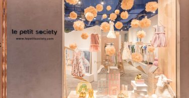
The design incorporated a nostalgic shophouse-style accordion metal gate at the entrance of the shop. When the idea was proposed, the designers did not realise how difficult it was to find a local supplier for this gate at the present time. The metal gate had to be procured from Malaysia as the fitting-out contractor and design team were not able to source it locally.
This vintage sliding gate conjures nostalgic memories and familiarity that adults can relate to, which was something that they grow up with but is becoming less common nowadays. The designers hope to reintroduce it to the children that come to the shop and give it a modern twist with a coat of refreshing salmon-pink paint.
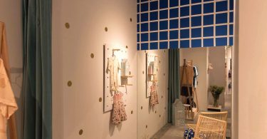
Different zones were created within the limited compound of the shop for varied uses and with a distinctive yet coherent design identity. There is a small library corner in the middle of the shop for storytelling events to be held, and a party table for mothers’ get-together and sharing sessions. The changing room is also comfortable and large enough to be turned into a nursing room, if required.
PROJECT DATA
Project Name: Le Petit Society “In Real Life” Concept Store
Location: #03-10 OUE Downtown Gallery, 6A Shenton Way, Singapore
Completion Date: June 2017
Gross Floor Area: 600 square feet
Client: Le Petit Society
Owners: Robyn Liang; Dylan Ong
Interior Design Firm: TA.LE Architects
Principal Designer: Tay Yanling
Other Designers: Liao Xiji; Nguyen Thao Di
Interior Fit-Out Contractor: KOSS Interior Pte Ltd
Images: TA.LE Architects

 Malaysia
 Hong Kong
 Indonesia
 Tiếng Việt
 ประเทศไทย


