Winner of Residential Category | Singapore | BCI Asia Interior Design Awards 2018
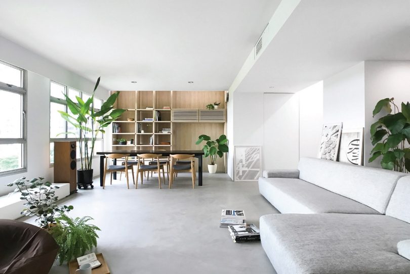
The design for the interiors of a new Housing and Development Board (HDB) five-room flat in Sengkang is driven by aspirations to create a mini house out of a typical flat unit and place the simple luxuries of space, light and greenery within the reach of heartland dwellers. With a floor area of 110 square metres, the true potential of space within the flat is unlocked through the bold intervention of removing all existing non-structural internal walls.
Entrenched notions of the interiors of an HDB flat are left behind, and its design forges forward with a purist approach toward architectural space making. Contemplated interplays between light/darkness, solid/void, dynamism/stillness and the flow of space fleshes out a living, breathing mini house.
SPATIAL DESIGN
Designed as a mini house, this flat enjoys the luxury of expansive openness, filled with natural light and calming greenery. The confines of an apartment give way to a liberating sense of spatial depth, achieved by the removal of all existing internal walls aside from those enclosing the bathrooms and household shelter.
Strategic placement of sliding partitions and a full-height glass wall, coupled with privacy curtains, allow two bedrooms to be independent spatial units that continue to form part of the larger living space. The master bedroom is accessed from the indoor garden, with views out of external windows—a key spatial reconfiguration that departs from the typical layout of having an internalised corridor leading to the bedrooms. Sliding partitions incorporating operable shutters enable the guest room to be either naturally ventilated via the indoor garden or air-conditioned. With the sliding partitions and privacy curtains open, the visual depth of space extends throughout the full width of the apartment, pleasingly animated by the interaction of light.
COMFORT
The open-plan layout creates a sweeping expanse of living-dining space that is emotionally uplifting, a welcome retreat from the crowdedness of urban living. The space starts to breathe and become alive, changing through the day and adjusting to different routine needs. This fluidity is especially stimulating for children, who are thrilled by the interactivity and scale of available play area.
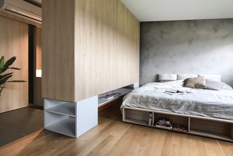
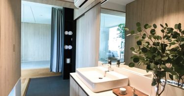
The master bedroom has been effectively rezoned into a vanity-wardrobe area adjoining the master bath and space accommodating a king-sized bed. This is made possible by relocating the wash basin within the master bath to the external face of the bathroom enclosure. A full-height wardrobe is lifted from the floor by a bottom steel frame, allowing natural light to partially filter through its base and brighten up this area. Relocation of the wash basin also freed up space within the master bath to accommodate both a 1.6-metre length bathtub and a separate shower stall, enabling indulgent and invigorating bath routines.
AESTHETICS
Spatial layering forms a dominant language in the design—space seems to multiply and become enriched when the range of its malleability is increased. The way light interacts with space changes when elements are mobile, and the depth of view shifts with the movement.
Outermost corners of spaces are framed in a way to make them appear to stretch out toward an expanded plane. The controlled use of simulated skylights further strengthens the visual impact of space extending outwards.
Unifying elements on the same plane similarly gives the effect of spatial expansion. For instance, a continuous feature wall integrating two concealed doors unifies and extends the wall plane that defines one end of the guest room. One of the doors camouflages the common bath entrance, while the other leads to a walk-in wardrobe serving the guest room. This feature wall visually continues, albeit across a glass wall, into the master bedroom where it morphs into the vanity counter.
INNOVATION
Flexible enclosure of the guest room is achieved with full functionality, made possible by the integration of two concealed single beds. One is tucked away beneath the raised timber deck of the indoor garden, to be pulled out when needed. The other is a wall bed that is stored upright as part of a short wall and is folded down during bedtime.
A curved curtain track recessed into the false ceiling caters for a privacy curtain to be drawn next to the common bath entrance, demarcating a passageway independent of the guest room.
The indoor garden transforms circulation space into a meaningful area for relaxation, where one is able to relish the sight and smell of plants thriving within integrated planter stands next to the external windows. Mobile self-watering pots sit within the planter stands for the plants to be easily moved around for regular misting and repotting. High levels of lighting next to the windows are a boost for plant growth, enhancing the long-term viability of the indoor garden.
REALISATION EFFICIENCY
The strength of the design lies in its ability to work within the framework of a standard HDB flat, while at the same time expanding its possibilities. Freed from the thinking of rigid containment within bedrooms and instead approaching space in its purity, heartland dwellers are able to own ‘mini houses in the sky’ with an elevated experience of space.
PROJECT DATA
Project Name: House in a Flat
Location: Singapore
Completion Date: 31 January 2017
Client/Owner/Developer: Lee Liting
Gross Floor Area: 110 square metres
Interior Design Firm: NITTON Architects
Number of Rooms: 2 bedrooms
Lighting Consultant: ERCO
Interior Fit-Out Contractor: Classic Ideas
Images: NITTON Architects

 Malaysia
 Hong Kong
 Indonesia
 Tiếng Việt
 ประเทศไทย


