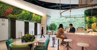
A home, apart from being a space for people to live and rest, can also be a place for expressing wishes for their families. The dream of this house owner is for the three-generation family of six to have a home that is comfortable and warm, with plenty of space for family and friends to get together.
The spacious three-storey house consists of the guest dining room and kitchen, children’s room and master room. The spaces on each floor were widened and replanned for flexibility so that they can be divided into different regions for various uses when necessary.
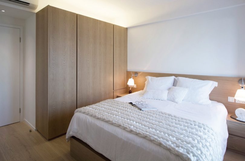
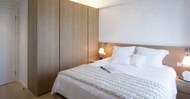
Simplicity is key in the design. Therefore, cool colours and crisp neat lines are used in the ground floor living room, with carefully selected furniture that are both fashionable and comfortable. Light-coloured oak and pastel colours provide the bedrooms with warmth and comfort, while the children’s room are designed to match the active character of its occupants.
SPATIAL DESIGN
In the original layout, the dining room and kitchen were on the first floor, and the bedrooms on the second floor. As the owner wanted plenty of room for movement, the dining room and open kitchen have been relocated to the ground floor instead.
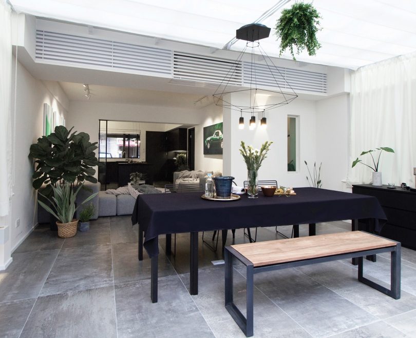
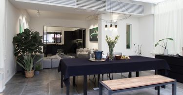
The design concept for the dining room is ‘picnic in the garden’.The three sides of the dining room windows have been greatly expanded with sliding doors and glass skylights, which helps transfer natural lighting to increase the liquidity and sense of space.
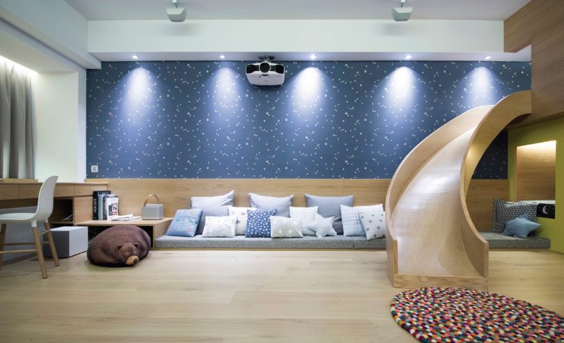
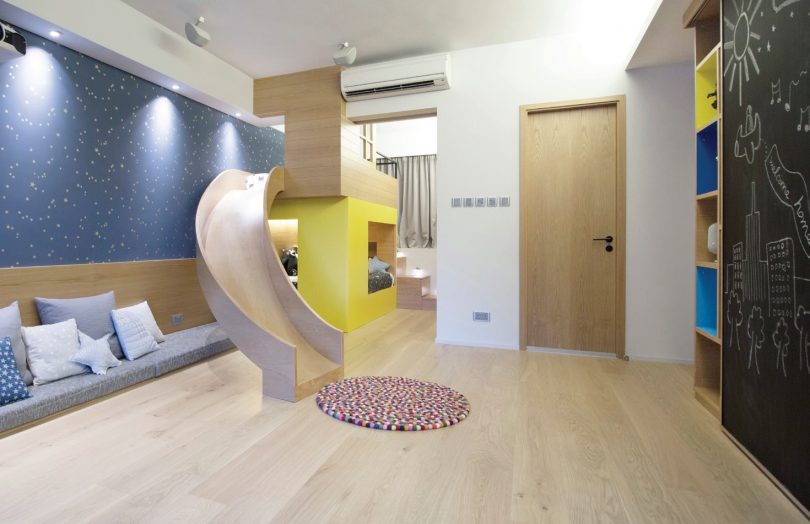
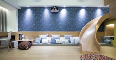
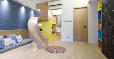
The children’s room and the master room are located on the next two floors. The original dining room and kitchen area have been transformed into a 500-square-feet children’s room and game space, which provides ample space for play and imagination for the two boys who call it home. An arc-shaped slide extends from the upper and lower lattice beds, allowing the children to slide down to the games area. The angle of the arc has been carefully calculated and a design template was embedded by the craftsmen.
Both the children’s room and open kitchen are equipped with sliding doors, allowing the space to be more flexible and autonomous.
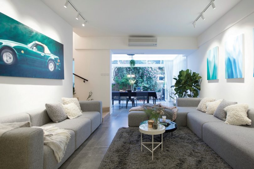
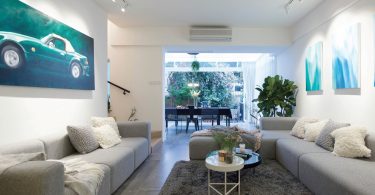
In order for the family to get closer, the living room does not have a television set. Instead, two sets of sofas are set up so that the host family can invite more friends over.
AESTHETICS
The house owners are a young couple who like simple but stylish design. Their favourite black, white and grey tones were used in the living room; while the background of the dining room is a touch of pure white, with grey and black furniture, oil paintings, lighting, cushions and rugs that present a stylish but warm space. Lighting was sourced from abroad and used in both the living room and dining room for a homey and cosy style, yet keeping a spacious look. The local oil painting creates a home-based feel by showing homegrown culture.
In contrast, the kitchen sports a dark tone. The ground floor is fully paved with concrete tiles, which can be easily cleaned, that extend from the kitchen to the garden.
PROJECT DATA
Project Name: Seasons Palace
Location: Yuen Long, Hong Kong
Completion Date: July 2017
Site Area: 220 square metres
Gross Floor Area: 150 square metres
Building Height: 3 metres
Number of Rooms: 3
Interior Design Firm: Chill Interior Design Company Ltd
Principal Designer: Ronald Cheung
Main Contractor: Chill Interior Design Company Ltd
Images: Addy Poto

 Malaysia
 Singapore
 Indonesia
 Tiếng Việt
 ประเทศไทย


